
Blogpost
Branding in art
This year is a new beginning for me in many aspects. One of it being the changes in my creative work. I rethought my approach to art and wanted my visual identity to reflect this change.
So in this very first blog entry I'm going to talk about how to approach rebranding yourself and I’m asking whether being a brand is even neccesary.
What is branding even?
Roughly speaking, Branding is the process of creating a unique visual appearance for a product, company or in this case: a person. You would most likely come across this term when learning about graphic design since a company logo is the epitome of branding. Everyone knows which company I'm talking about when referring to ‘a bitten apple’. And exactly that is the goal of good branding: public recognition value.
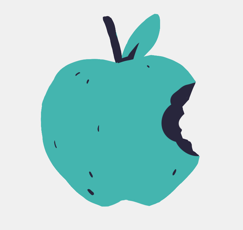
Know this company?
How is that applicable to art?
Actually, a lot of artists do this subconsciously: Whenever you sign an artwork with your very own, unique signature, it is branded. And not only that, it’s a seal of certification: This artwork was made by you and not anyone else. Despite being the most primitive form of artist branding, it is still relevant today - especially in traditional arts.
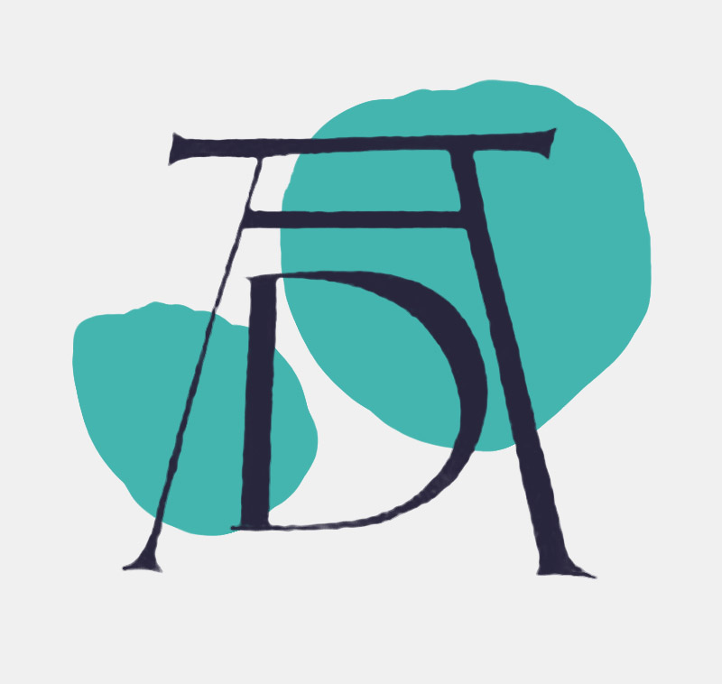
The signature of Albrecht Dürer is over 500 years old but still recognized today.
Style as a form of branding
Another subconcious but powerful form of artist branding is the art style. “It looks like a Monet”, “Reminds me of Ghibli”. When a name is used as a synonym for a certain aesthetic it’s a good sign that the artist had a consistent style that got popular, thus connecting said style with the artists name forever. And that essentially describes the very meaning of a brand.
Now, the search for a unique style is probably one of the hardest obstacles artists have to face in their career. If you are still in search of a style or just don't want to settle on one: Don't worry, it's not a necessity for success. Many companies actually look for flexibility as opposed to just one certain aesthetic.
Make your appearance coherent
An essential element of branding is to create an identity. And identities are set in stone through coherence. That is to say, try to keep the same appearance on all platforms you present yourself on. Whether it is on social media, your own website, business cards or even invoices: don’t use different logos. Avoid wildly different fonts. Try maintaining some sort of main color that will be used in your logo, icons, background colors etc. All this helps strengthening your visual identity.
Let your appearance reflect your work
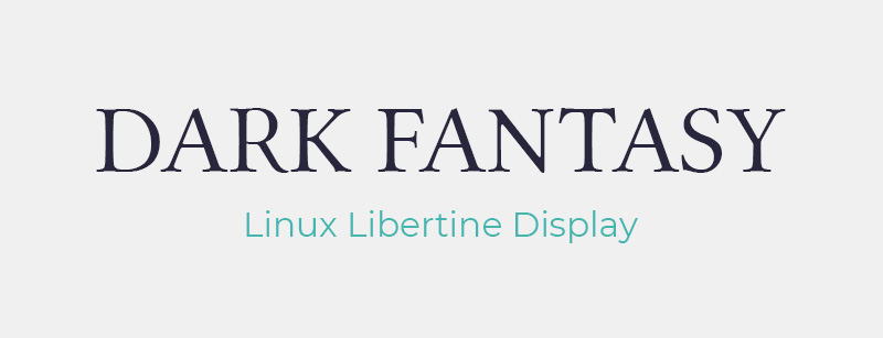
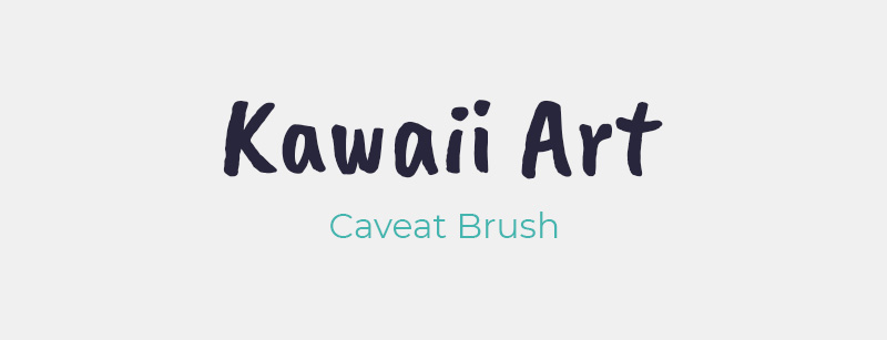
A way to further deepen your artist identity is to complement your art with a fitting surrounding. Let's say you are an artist who loves to draw dark fantasy. In that case it's probably better to use muted colors, and a font that is usually connected with that sort of topic, i.e. a serif font. On the other hand, if you love drawing colorful kawaii art, use vibrant colors, round edges and a friendly font, e.g. a brush font.
My approach
To clarify what I mean with all this, let me tell you some of the thoughts I had in the process of my rebranding.
Font choice
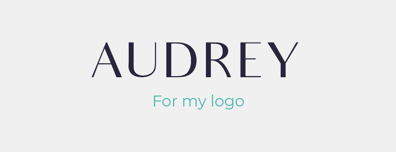
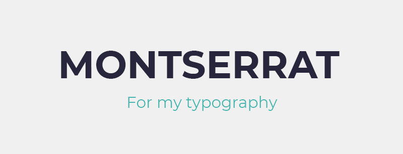
Whenever it’s possible I try to limit my typography to two fonts: For my logo I went with Audrey as it looks modern but still oldschool. For my general typography I use the brilliant Montserrat typeface. If you are searching for good, free fonts, try out google fonts. And please don’t use Comic Sans or Papyrus. Just don't.
A versatile color palette
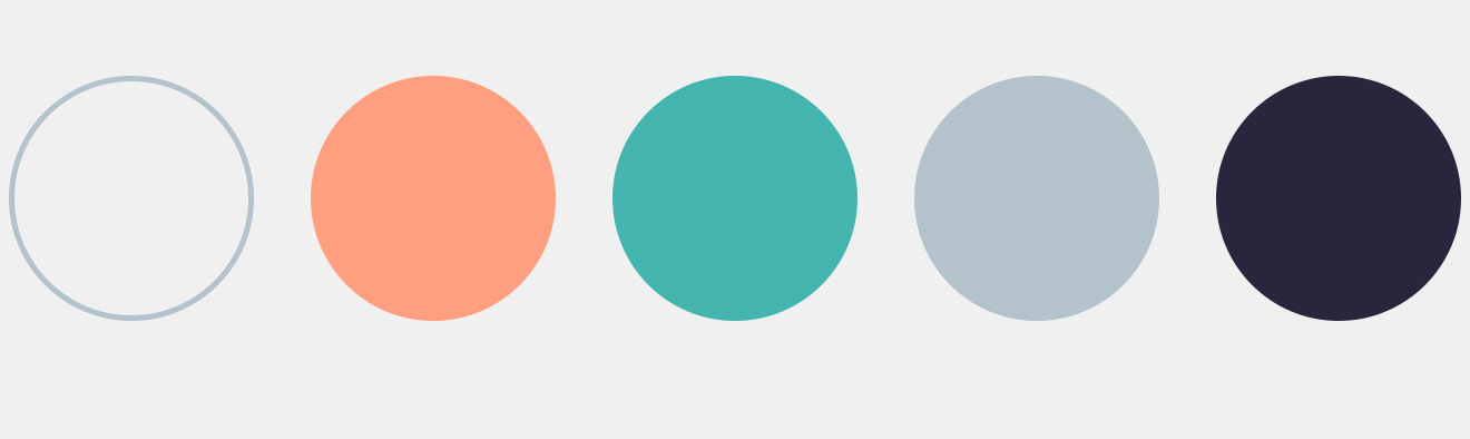
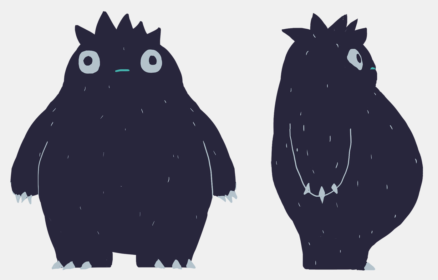
When I was creating my color palette I asked myself how I would use it. Right from the start I planned to make illustrations with that palette so there were a few things I would have to take in mind: I need one neutral dark color and one neutral bright color. I needed orange to cover the spectrum from yellow to pink and turquoise for green and blue hues. Lastly a blueish mid gray in case the bright gray was, well, too bright. In a way I was approaching it like a pixel artist would choose a color palette: find fitting and versatile colors within a limit.
With this in mind I went to Coolors.co which is a great online tool to build up color schemes. This palette was then used for anything concerning branding such as my logo, this website, business cards etc.
Personal Illustrations
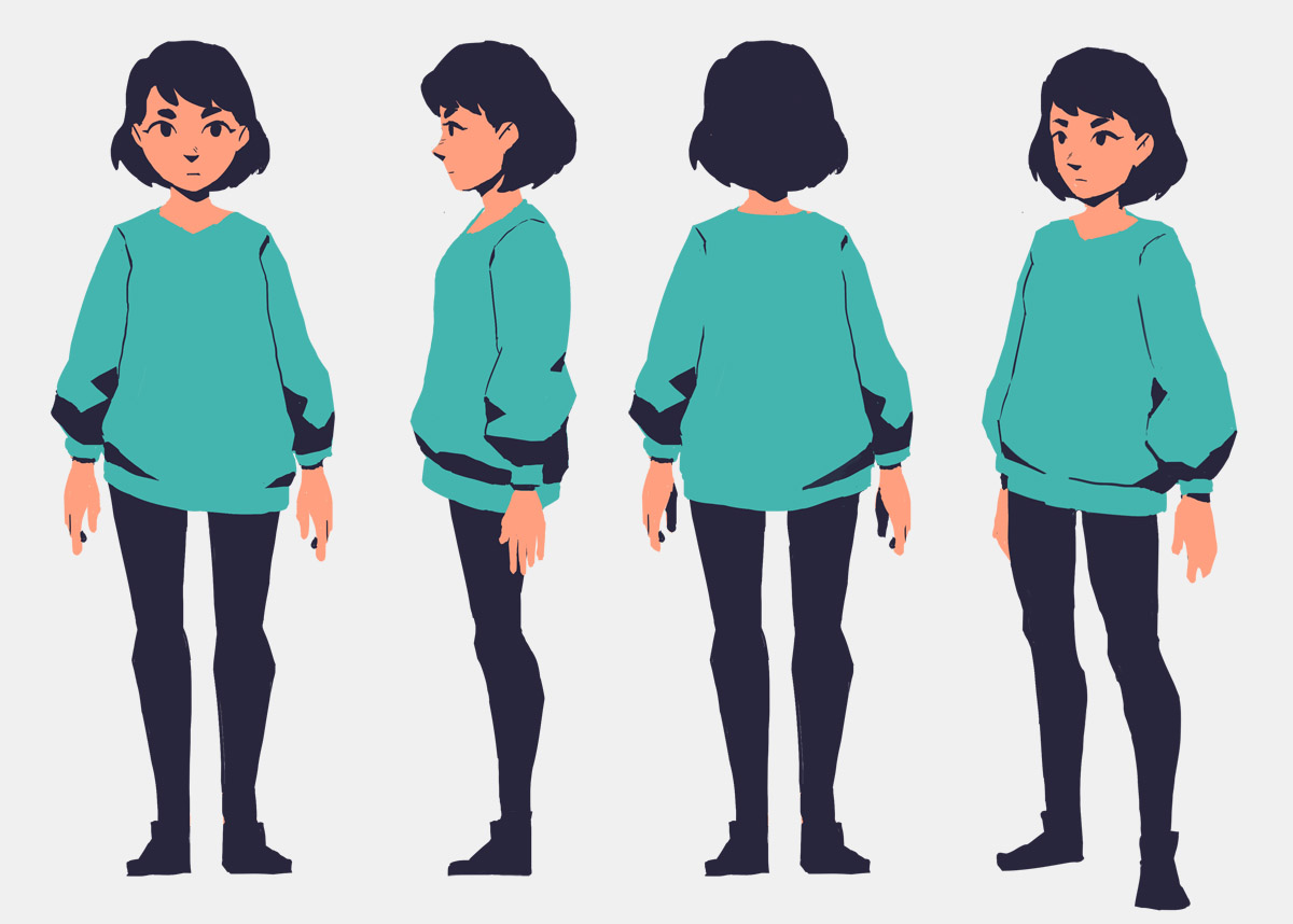
Within that color palette I also do personal illustrations that are mainly used for this blog, social media or animated tutorials. The first one of these animated tutorials is currently in the making. It's going to be a short film on how to overcome an artblock - a topic that is relevant for most artists.
And these two are the main characters using my color palette:
Conclusion
In the end your audience won't like your stuff because of your appearance. They will like your stuff because they like the way you draw. Because they find your intricate details amazing. Because they have this special feeling when looking at your work. Nonetheless, having a coherent appearance can help your audience, clients or anyone remember your name. And as the art industry, like any industry, is a world of competition, that certainly is of importance.